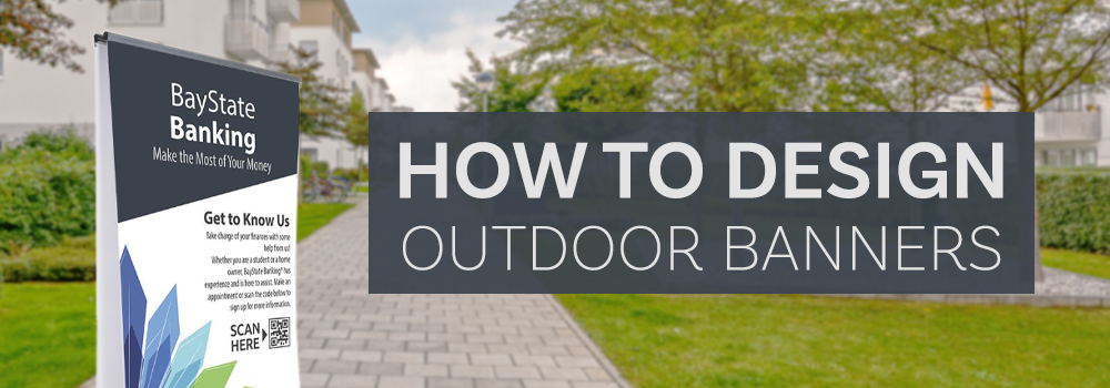
Outdoor banners are a great way to advertise a company, future event or simply to send a message. We present below several aspects to be considered when designing an banner for outdoor, also applicable for outdoor exposed banners:
Visibility
You can order customized banners in a variety of sizes. The sizes depend on the location where you want to place the banner. Make sure you choose the right size for the distance at which you want the banner to be seen. If you want that it can be read from a greater distance, then a larger banner will be more efficient. Also, consider exactly where the banner will be located and what obstacles may have to face. Visibility is an extremely important factor when taking into account the size of the banner.
The overall design
Another important factor is the overall design of the banner. You have to consider the use of the right colors, do not use too many fonts and you do not have a background that makes the text hard to read. If you are not sure of your choices, the best option may be hiring a graphic designer to make a layout that meets your desires.
You may have many details that you want to send about your event or product with the banner help, but you should remember that people usually have only few seconds to perceive the message that you want to send. So your banner should contain only the strictly necessary information. Banners with too much text can remove the viewer, it can consider that is too much “work” to read a lot of text reading. It is better for your message to be composed of a few carefully chosen words accompanied by contact details with which the viewer can find out more.
For any type of exterior design less is better! Leaving space around the edges (is recommended at least 3 cm of edge safety) and avoiding filling the available space with text will increase the impact that used elements have. Be concise, but make sure that the necessary information is included.
The fonts used
Limit yourself to one or two fonts for your banner, visibility is more important than style, though with a little effort you can have both. If you use two fonts make sure they are complementary. When you select font size for the banner, consider the distance at which it should be read. If the viewer is 30 meters away, the letters should have a height of at least 10 cm and at a distance of 110 meters letters must be 40 cm. These values are however indicative and may be affected depending on the colors and fonts used.
The colors that are close to each other, such as green and blue, creates a poor combination for a banner since have similar contrast. Alternating colors, such as blue and yellow, produce the best combinations due to existing contrast. Black contrasts well with any light color and white work well for dark colors. The combinations most commonly used for visibility of the best are: black and yellow, black and white, yellow on black, white on blue, green on white, blue on yellow, white on green, white on brown, yellow on brown, brown on white, red on white, yellow on red, red on yellow, yellow on white or white on red.
Using images
As mentioned before, banners can be color printed, therefore, images use can be very effective. When using images consider what kind of people you want to attract and use some images that they will resonate. When print for outdoor choose images that catch the eye and are easy to “read” and make sure that they have enough room to “breathe”. If an image is of poor quality there is risk it to spoil the overall look of the banner.
Finally it is important that the customize of your banner be a process whose outcome to entertain. You can experiment with your design, but make it easy to read and suitable for the target audience. The colors and fonts chosen will reflect on your company image. If you have any questions about design, do not hesitate to contact us, we are always willing to help.