DESKTOP PUBLISHING is a process of arranging text and graphics in a document
(A virtual page) to obtain a document for typography or printing. Desktop publishing is not a linear process that has some specific steps. During the work process it often returns to a previous step for different adjustments.
First you need the software for the specific project that you start: QuarkXpress, InDesign or another program similar for books, magazines (projects that contain a lot text) and Corel Draw, Illustrator, Photoshop for brochures, advertisements, business cards (projects oriented more towards graphics with text in the background). In desktop publishing it is required a minimum knowledge of using such editing programs and layout. An article with a few steps to follow in any DTP project.
Working sketch
Before starting to work in particular editing program, you need an idea of what you’re about to execute. For a work plan is recommended that you make a sketch. The sketch can be done in pencil or pen and aims to establish some ideas before starting the project work. The sketch doesn’t have to have a lot of details, it must pursue the necessary elements (logo, text, etc.), the position of these elements in the page and the relationship between these elements. This step is good for those who start – but even those people with more experience should not avoid this step.
It is not necessary to use details. For logos and space for text or image is sufficient the use of markings (lines, hatched rectangular areas). No need of accurate dimensions and images, but approximations, but that respect somewhat the size scale. All items in the layout should be sketched proportional with the page. If the sketch is done directly in the project’s software is possible to orient in opposite directions that will not help the build of graphical idea: you can focus on choosing a font (not necessary in this step), in very precise alignment, etc. More sketches, more graphic ideas.
Use a template for inspiration
A template is an electronic document designed on standard sizes and formats: business cards, greeting cards, letterhead pages, brochures, etc. In general desktop publishing programs are accompanied by such templates. The idea is not to use this template exactly as it is for many customers but to have a starting point to begin a project.
Each designer can realize its own templates to facilitate their work and to come quickly to meet customer desires. An experienced graphic designer probably will omit the use of a template.
For a newcomer in the design world, the use of a template for inspiration could mean: saving working time, giving customers more choices, maintain unity of a project with other sub-projects. Most programs come with their own templates, but avoid using them exactly as delivered (certainly the same template are used by more people).
A template is useful when approaching the graphics that we want and that customizations are not very difficult and time consuming.
Setting the document
An electronic document is a virtual page of a certain size, choosed by us or standard (A4 represents 297mm x 210mm a standardized bussiness card is 90mm x 50mm). Color space setting is required. For documents to be printed is required CMYK color space setting, for documents made for the web is generally used RGB.
Working with text
In desktop publishig the text receiving mode from the client takes many forms. It may be in electronic format (is the recommended mode because it saves working time, and thus no need for typing and avoid typewriter error related, assuming the text file has already been corrected). Another format is the classic on phisycal support whose requiring passage in an electronic format by typing or scanning text and converting it into a format that can be edited (using optical character recognition programs – OCR).
Working with text means its placement in layout, according to it designing and formatting (choosing the type of letter, size, alignment, spacing, color, choosing a style for titles, one for body text, etc.). Working with text is an important step, especially when it is a large amount of text (magazines, books).
This means knowing the characteristics of a font, forms of individual characters and aesthetics of a special font. Text composition is the way the texts are arranged in page. This involves arranging text and the change of the visual appearance of the text. This step is one that will be return to over during work according to newly emerging needs in relationship with other graphics text.
Working with graphics
This step, like working with text is a point on which will be returned to often during a project. The step is the work with vector and bitmap elements, digital or classic format (these images will be converted to digital format by scanning). This stage includes the creation of images and illustrations in specialized software and handling any image. The graphic elements outside of their layout according to design require verification and process to meet the standards required for printing.
If the project is focused around graphics, it should generally first settlement of these elements and then the text. In case of projects with high expanding text, working with pictures is subsequently to processing the text, but is not a rule.
Desktop publishing design rules
After completing the layout is time for desktop publishing application rules. The purpose of these rules are realizing attractive looking documents and prepare them for printing.
For a more pleasant look, there are some directions to follow but these are not rules that need to be followed.
* Using a single space after punctuation and no space before them, this advice not only help a pleasant appearance but also help in working with dtp program ( avoid a comma situated at the end of a row to jump to the beginning of the next row, when normally it has to be linked to the word that follows it)
* Use fewer fonts, choose the best typefaces for the project started (see Choosing and using fonts)
* Find the optimal relationship between the letters size and the number of characters in a row (see Layout – font)
* Work on the design (brochures and magazines keep only graphics that help the project, removing insignificant items, and in the books do not hesitate to use more white space)
Rules of desktop publishing for pattern
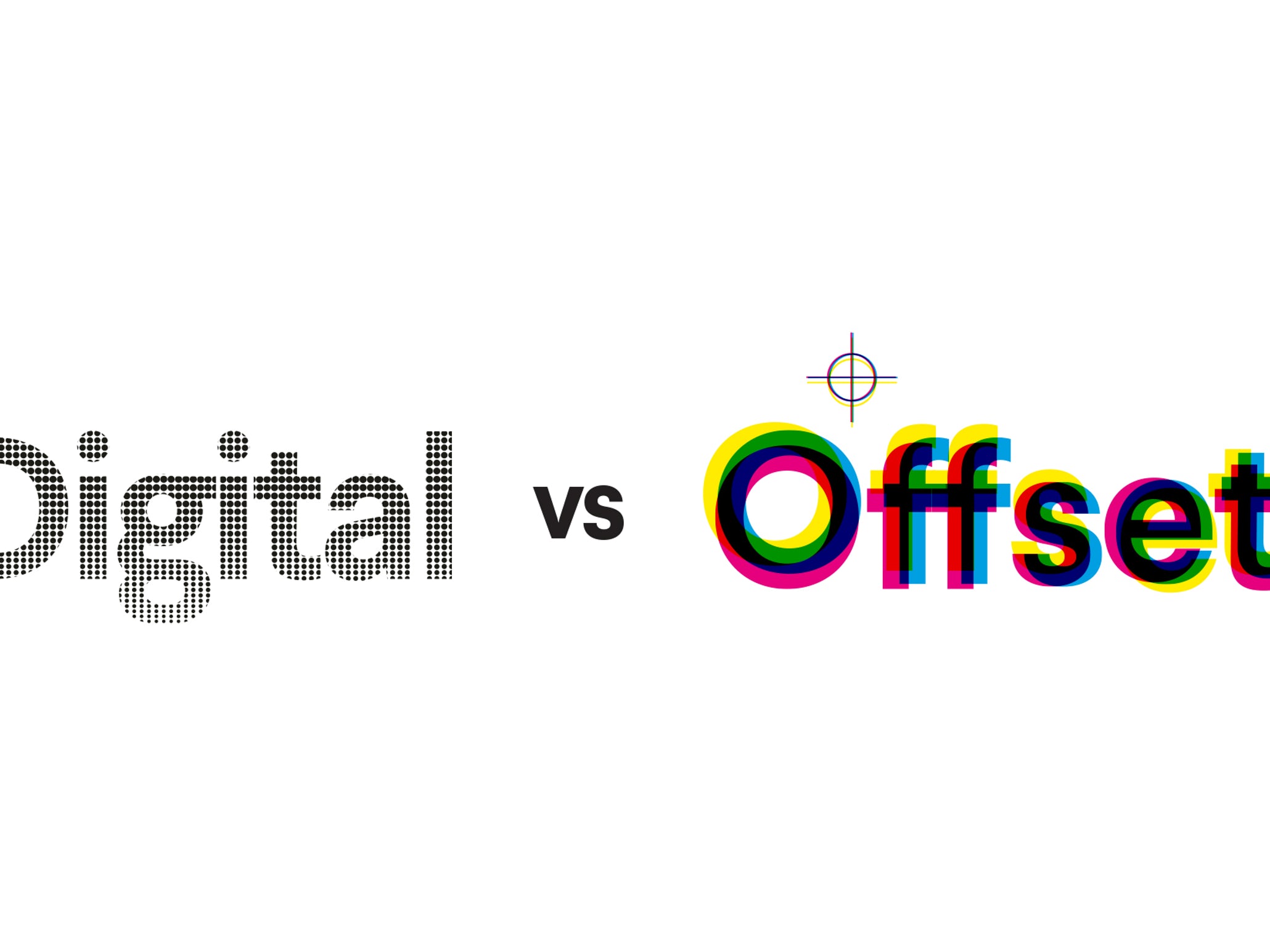
These rules are necessary to obtain a final product without errors. tThe rules must be applied at the end of each project. Most times it is more efficient if applied even during work on the project in layout phases of text and graphics. These rules are not necessary if it is a digital printing systems (laser printers, inkjet) but are required to be made if it is about sending a document to typography.
* Overprint (see What is the overprint)
* Trapping (see What is the trapping)
* Checking image quality (300dpi for typography, plotters and other printers 150 dpi)
* The text and thin elements in a color to avoid inaccuracies
* Color space conversion to CMYK (this rule is only required for documents prepared for typography), most programs for DTP are able to pass automatic in CMYK space to pattern export, but for better color control, it is recommended to do this manual (see Color spaces – RGB and CMYK)
* Use special colors if necessary. Besides that avoid certain typographical errors in their use, often you can save money
* Adding crude (bleed). The dimensions of the layout must have additional margin, generally 5 mm, and for performance typography 3 mm is sufficient. This bleed will fall at cutting.
Making a proof (for good pattern)
Apart from the need to calibrate your monitor to make sure that we see the right colors is required a verification by printing of what you have made in digital document. This proof verification is not only for color verification but also to ensure that all graphics are in the right position and to check and correct any grammatical errors and text.
Typography / printing project
Once done the steps above, the document is ready to be sent to print, whether it’s laser printers, inkjet printers, typography, serigraphy or pad printing. For printing you can send the original file. If Quark software (and other similar programs) are attached to file and other necessary items, not included in the document: font, images, etc. In some programs, like Corel software, texts can be converted to curves to avoid errors related to fonts. Editing programs allow you to save the document in safer formats for printing , such as PDF, a type of very safe and useful document for printing, if it is set correctly. Also use other types of files: tiff, eps, etc. Jpg file is also useful if at saving is not compressed excessively.


