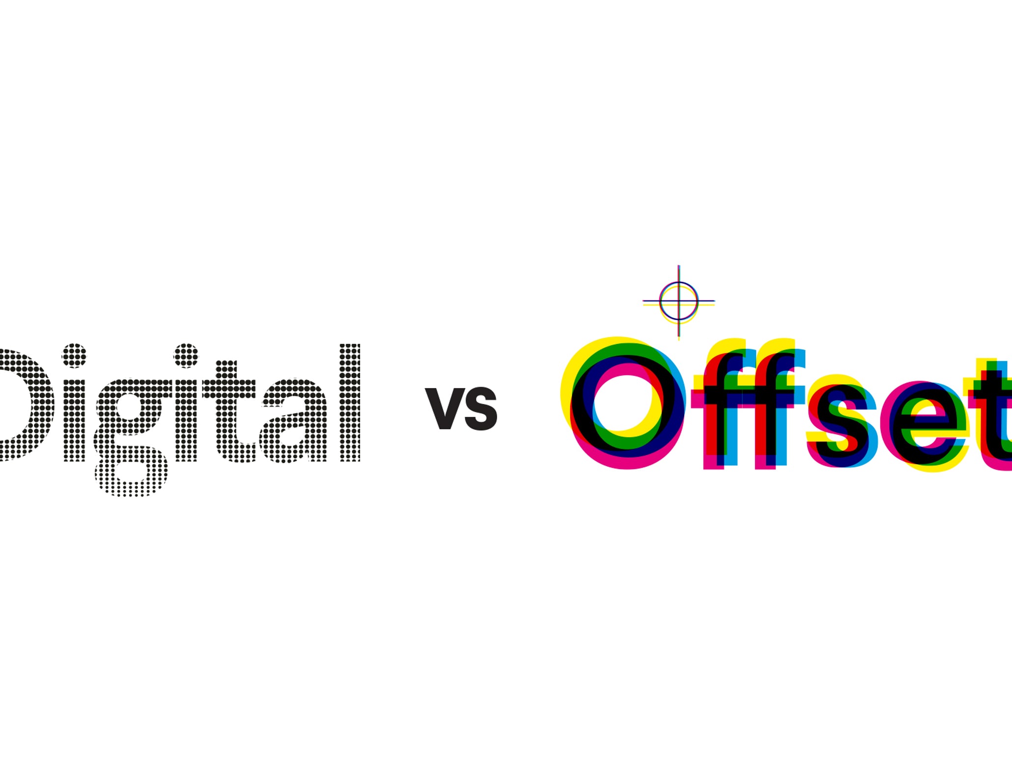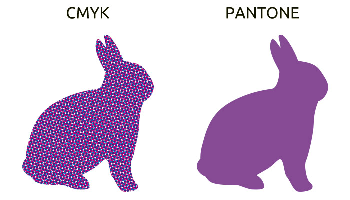
The CMYK color palette (Cyan, Magenta, Yellow, Black), used in offset printing at 90% of orders is suitable for reproducing color photographs and drawings, while special colors, while Pantone are used to obtain a precise shade from a certain color, which you can reproduce identical in several places within the same work or more; practically Pantone color will always appear the same, without unwanted color variations that mixture of the four CMYK colors can’t avoid in most cases.
In CMYK, a certain shade is achieved by overlapping screens with different percent values of the 4 basic colors, cyan, magenta, yellow and black. It is more difficult to control the combined values of 4 colors (CMYK) than one color. As an additional advantage, Pantone range is much more rich coloristic than CMYK range.
Graphic identity of a brand is generally regulated in a manual that specifies the precise color of each composition graphic logo.
Colors are defined primarily in Pantone color-register (usually used to print business cards, letterhead, envelopes and Notepads), then are specified the equivalents in CMYK register.
Often are visible color differences, in some cases even harder to accept, between Pantone shades and their CMYK equivalent. This is highlighted by the samples that Pantone company edited.
Pay attention to files preparing, which should not contain graphics or photos in RGB color range! All patterns use CMYK inks or Pantone, not RGB. Only monitors use RGB system for color reproduction, and digital cameras and scanners to capture color images.
It resorting to Pantone colors when you want to print into one one or two fixed colors and is less expensive to use two Pantone colors instead of four (CMYK). Generally, when you print polychrome brochures and catalogs, containing both color reproductions of images (photographs, graphs, drawings) and graphic identity of the company (logos, marks repetitive titles in the colors of the logo, etc.) is good to analyze the posibility of printing in CMYK + Pantone colors at somewhat higher costs but with stronger effect.
To only print in CMYK at lower costs, converting the colors of the logo, means taking some risks, such as color slightly dull in some situations or slight variations of shade.
Practice, however, shows that often use only variant CMYK color base for several reasons. Before taking this decision, it is good to consult us, because the solutions are different from case to case, depending on several factors which must be considered.
When you are printing black and white images in a picky catalog, you should keep in mind that these photos be reproduced in duotone or full color (CMYK) to acquire depth and give the richness of grayscale or to have the opportunity to transfer easily from a neutral gray or sepia gray to another desired shade.
Obviously duotone version is more economical than the CMYK, except that, in addition to black and white images, you also have to reproduce color images. Duotone is a combination of two Pantone colors, one light and one very dark, possibly black.
Each of the two colors and their mixture will add more classic black and white palette tones, especially in the light area (1-10%) and dark (90-100%), allowing to achieve smoother transitions between similar intensities.